Preamble
Skip to the good bit
After a recent discussion about adding headings with a drop shadow to document directly in Ovation Pro, without using an external app to produce a graphic – such as ArtWorks or Draw – lead me to do some experimenting.
My first thought was to create the heading text within a transparent text frame of its own and duplicate the frame with a small offset to shift the two lines text. The top most frame would also need its Text flow setting to None (Ctrl+Shift+T). The text behind could then have styling applied to create a lighter shadow effect – but that method is fiddly and would require the exact same offset throughout a document so all the headings would match.
So, to make it consistent I had the idea of creating two styles; one for the heading and another for the shadow. Using a combination of the (Text) V shift and (Format) 1st indent values across the two styles it is possible to create the offset needed to produce a nice shadow effect and keep the two frames at the same x,y position. Although this proved to be a better method it still wasn't great, as it would mean break up text flow to create separate frames every time a heading is needed.
My final approach was to create the drop show headings within the text flow and not rely on separate frames to hold the heading text.
Drop Shadow Styles
This method works by defining two separate styles; one to set the look and style of the heading (called DS-Heading), and a second to control the shadow (DS-Shadow). And you will need to duplicate the heading text twice on separate lines, either by typing it twice or by using copy and paste.
Style 1: DS-Heading
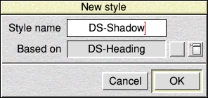
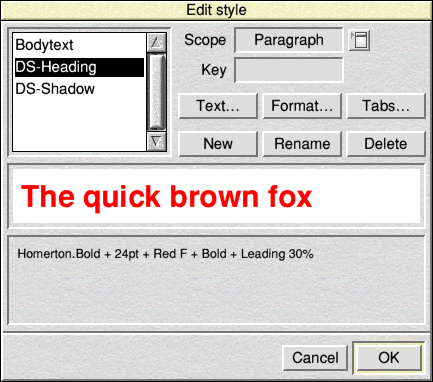
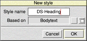 Start be creating a new style called DS-Heading. Of course, you don't need to use the same style names as I've used in my example, you can use any you like.
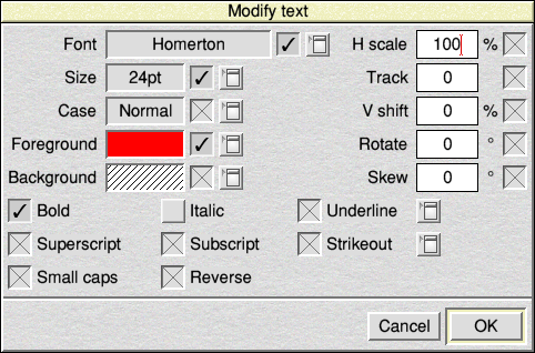 This first style controls how the heading will look, so in the Modify text dialogue box pick your font, text size, colour etc. as you require it look. In this example I've used the following:
- Font: Homerton.Bold
- Size: 24pt
- Foreground colour: Red
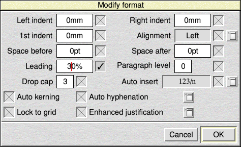 In the Modify format dialogue box the only thing I've set is Leading: 30% to give a little extra space over the Bodytext style, which is set at 20%.
 At this stage you can try out your heading style to see if everything is as you require it.
Style 2: DS-Shadow
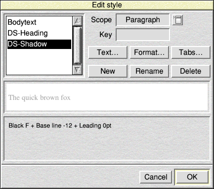
 The next step is to create another new style for the shadow effect (DS-Shadow).
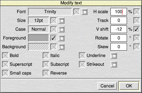
 In the Modify text dialogue I've only set the Foreground colour and the V shift values as follows:
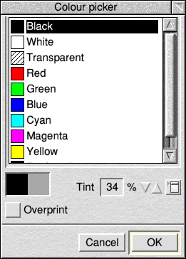
- Foreground colour: Black with 34% Tint
- V shift: -12 %
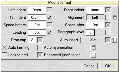 For the Modify format setting, again just two setting are set:
- 1st indent: 0.5mm
- Leading: 0pt
Of these setting the important ones to note are:
- Text – V shift : This sets the vertical position of the shadow. The value required Zero would place the shadow on the same line as the heading. A negative value moves the shadow down lower than the heading text. A positive value moves it up.
- Format – 1st indent : This sets how much the shadow is shifted to the right.
You can play around with these two value to move the shadow to a position that looks right for your chosen font style and size.
How to use the styles
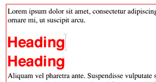 The heading text needs to be typed twice, once for the heading itself, and a second for the shadow – separated by a new paragraph using the [Carriage Return / Enter] key.
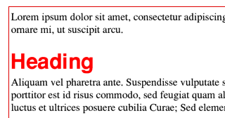
Both of these lines of text need to have the DS-Heading style applied, which should look similar to this.
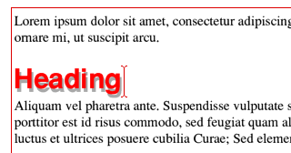 Next, to complete the effect, apply the DS-Shadow style to TOP/UPPER line of the heading – job done!
[Tip: If the styles have their scope set to Paragraph, as is default when creating a new style, then you don't need to select the heading text, just apply the style with the caret on the line.]
What's Going On
Let's have a look at what is happening with these two style and why it works. Both lines of text need to have the main DS-Heading style applied so that they both get the same font styling. As this one style controls the overall text styling for the headings, it makes it easy to change font or size of the headings at a later date with only this one style needing an edit.
When the top line is applied with the DS-Shadow style it sets sets the colour to the lighter grey shadow and also sets the leading value to zero, which brings the second red line of text up to sit on the same baseline as the shadow, and in front of it – but then the negative 12 % V Shift value lowers the shadow below that of the main red heading text. The 1st indent value of set in the DS-Shadow style does the work of shifting the shadow to the right a small amount.
Other ways to style it
There are plenty of ways to play around with the styling of the drop shadow effect, for example try a different font for the shadow, or try a skew value with a zero V shift, to give a setting sun shadow.